Don’t feel embarrassed if you don’t know what a Colour consultant is or what they do. When I tell people I’m a Colour consultant they typically hesitate for a moment, I can see some part of their brain is trying to figure it out. Finally they ask, well what is that exactly? It’s a fair enough question because there are different types of Colour consultants. Some people specialize in colours for the garment industry. They keep track of dye lots and ensure consistency. Some people specialize in the very broad spectrum of texture and colour. These people may work for a running shoe company or for a manufacturer of cases for your iPhone.
What I am is an Architectural Colour consultant.
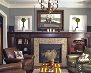 I specialize in helping either home or business owners chose paint colours for interior or exterior surfaces. The next question I usually get is, so you’re an Interior designer? No, I’m not. The only real crossover between a Colour consultant and an Interior designer is the specification of colour. For an Interior designer that can be just one small part of their job. Interior designers have to be able to draw up plans, understand building codes or fire rating classifications for materials. Interior designers and Architects often call upon the services of a Colour consultant because colour is a highly specialized field. Most people don’t understand the change that occurs in paint when it goes from a printed sample to a painted wall.
What happens during a Colour consultation, how does it work?
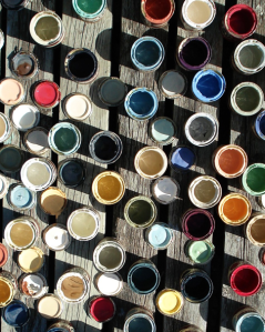
I work in a highly collaborative manner. With a few exceptions my clients are actively involved in the process. I show up at a person’s home or business with a special kit of individual colour samples from a particular paint manufacturer. I am an independent Colour consultant, I am not an employee of a paint company. Therefore one of the first questions I ask a new client is, what brand of paint do you want to use. Or, what brand of paint will your painter be using. I do this because I don’t like colour matching. Many paint companies make a big deal of how they can match any colour. Well, the truth is, sometimes they can and sometimes they can’t. It’s hit and miss and that’s why I don’t like it. Especially on exteriors.
The next thing I do is take a look around. I need to see all of the interior or walk all around the outside of the building. I need to take in the whole and hold that in my mind as my client and I work through each room or exterior. The best comparison that I can think of for this is a theatre or film director. A director has to have both an overall vision and the ability to make highly detailed decisions. That’s what I do. I understand the space in a different way, I’m looking at it through different eyes. They’re also fresh eyes, and that’s important.
I have to get to know my clients very quickly. I believe that the ability to understand colour is just one skill that I use. There are two other skills that I think are equally important for a Colour consultant to have: an open mind (never judge people) and intuitiveness.
Then we get to play with colour!
 Most people begin by being a bit timid. I start out by asking a few questions and then I begin placing colour samples onto a large neutral grey piece of cardboard that I carry with me. I work off both verbal and visual feedback. Sometimes a person will say, no I don’t like that colour, but when I placed it on the board they smiled. This is where it gets interesting because people don’t smile at something they don’t like. Part of what I have to do is break down people’s preconceived ideas about colour and what they think they like or don’t like. There’s an entire page on my website that is dedicated to one sentence, it is.
The perception is that choosing colour is a decision making process, it’s not. This is why people get stuck, it’s a creative process.
I’ll let you in on a little secret about the creative process – it’s fun! And because it’s fun before long the client becomes less timid, they tend to loosen up and get into it. Each in their own way. It’s one of the things I like the most about what I do. I love opening the door to the creative process for people.
But you know, adults can get a bit nervous when they begin to play…
The next thing I’m about to describe happens probably eight times out of 10. Suddenly my client or clients will get this panicked look on their faces. They’ve just realized that while they were in the midst of having so much fun they haven’t been paying attention to writing things down! They’ve forgotten that when I first spoke with them I told them I would be taking detailed notes. I’m not doing this constantly. In general I have a good memory. I’ve also been dealing with colour for a long time and have very good colour memory. At a certain point I need to get it down of course but the important thing is that my service isn’t just in the moment, it’s also the follow-up. People always look so happy and relieved when they realize that they can go back to having fun and not worry about being the responsible one.
So do I only work with colours for paint?
Not by a long shot. I also help clients chose tile, flooring, counter tops and cabinet finishes. I help them make decisions on crown molding or trim. On new builds it can be everything from window style and colour to gutters and paving stones.
Anything else?
Why yes. I may make suggestions for window coverings. I often make suggestions for re-arrangement of furniture. I have suggested removing doors and have also suggested changing the direction that a door opens. I have advised clients to switch the purpose of a room. For example, I worked with clients where one of them used the top floor of their home as an office. It was a big beautiful room that had a view and a large deck. The deck was never used (because it was off of an office) and the view was wasted because of the layout of furniture and because the person using it was busy working. Their bedroom was a room on the second level that was much too small. Why not switch them, I asked? They couldn’t believe they’d never thought of it. That’s not unusual, once people have settled into a space they just accept how it is. I’m an agent of change – the status quo is up for grabs with me. By the same token I have talked clients out of getting rid of beautiful furniture because they never used the room and thought it must be the furnishings. It wasn’t, it was the paint colour.
What happens after the consultation is over.
Each of my clients receives a detailed colour scheme from me that is theirs to keep. It contains all the pertinent information regarding paint colour name and number along with recommended sheen levels and a colour sample. I also include any other notes that I have made that will be important for my clients to remember. The other person who will now be coming on to the scene is the painter and it’s important for me to properly communicate what my client and I have worked so hard to achieve. Therefore my clients also receive a detailed colour schematic which lays out the placement of colour in a way that is easy for a painter to understand.
What value is there in a Colour consultation?
If you have ever stood confused and overwhelmed by the selection of colour samples displayed in a paint or hardware store. If you have wasted time and money collecting colour samples and buying tester pots only to feel disappointed with your selection. If you have ever painted a room or an entire house the wrong colour, then you already have an idea of the value in a Colour consultation. I am there as an objective professional, a guide, an ally and a presenter of choices not thought of. I am there to explain colour to you and to shatter colour myths and misinformation. And, I’m there to take care of you and this place that is your home or business. Many people have an expectation that they’ll be able to chose colour intelligently, when they fail they tend to be rather hard on themselves. But think of it this way, it’s highly unlikely that I can do your job.
Till next time,
Kora
Kora Sevier is a Vancouver Colour Consultant. She specializes in interior and exterior colour consultations for both residential and commercial clients. For more information, visit www.kcolour.com

 “Man needs color to live, it’s just as necessary an element as fire and water”. Fernand Leger.
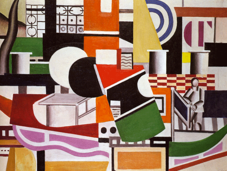 Fernand Leger. The Bridge of the Tugboat. 1920.


You must be logged in to post a comment.